


It seems that people don’t agree on much these days, but there is one growing exception to that rule.
Across the board, Americans are finding that the “system” isn’t working for most people in its current state. Donald Trump and Bernie Sanders have locked into this sentiment to garner unprecedented support as outsider candidates, and there is an undeniable feeling in the air that something has got to give.
Why is there so much conviction that things must change?
THE WEALTH INEQUALITY PROBLEM
In today’s chart, we showcase the wealth inequality problem in the best way we could. The challenge with it was that literally the data goes “off” the chart with no easy way to show it.
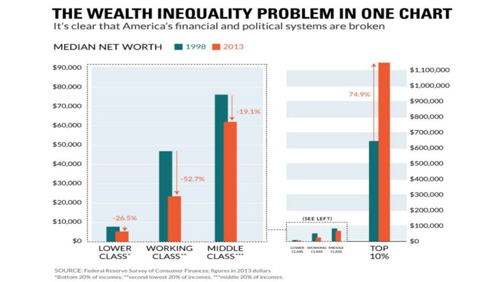
On the chart, we plotted the “Median Net Worth” of different wealth groups between 1998 and 2013. This is based on a study that the Federal Reserve does about every three years on consumer finances.
When this data is compared in 2013 dollars:
- The Lower Class: Wealth has decreased by 26.5% for the bottom 20% of incomes
- The Working Class: Wealth has decreased by 52.7% for the second lowest 20% of incomes
- The Middle Class: Wealth has decreased by 19.1% for the middle 20% of incomes
However, one segment has shot up “off” the charts:
- The Top 10%: Wealth has increased 74.9%, soaring to a median net worth of over $1.1 million.
THEN AND NOW
What’s changed between then and now?
We looked at this from a macroeconomic perspective to get a sense of what has changed between 1998 and today, using latest data from last month (May 2016).
- Unemployment is relatively flat between 1998 and today, but the amount of people actively looking for work has dropped by 4.5%. With more workers discouraged since the 2008 crisis, Workforce participation has dropped steadily. Economists also say this is likely due to a rapidly aging population.
- Inflation has averaged between 0% and 1% over the last three years. It is currently sitting at 1%. In 1998, inflation was closer to the Fed’s 2% target.
- The Federal Funds Rate, which is the rate that generally acts as a backbone for interest rates across the country, has dropped like a rock. Right now it was effectively 0.37% in May 2016, way down from 5% to 6% that existed for most of the 90s.
- National Debt has almost quadrupled in nominal terms from $5.5 trillion (1998) to $19.3 trillion today. In real terms, taking into account inflation, it has more than doubled.
- Money Supply (M2) has increased from $4.2 trillion (1998) to $12.7 trillion today. About $5 trillion of this increase came after the 2008 crisis.
And while there are many factors that go into wealth inequality, we believe that some of the above factors are worth exploring and understanding in detail.
- For example, who benefits from 0% interest rates the most?
- Who owns assets like real estate or stocks that have their prices propped up by these policies?
- Who can borrow capital at low rates to invest or speculate on rises in these prices – is it the people that already have money, or the people without any?
- Where does all the extra money that is added to the system go?
- What is each $1 trillion of new U.S. debt spent on, and do the benefits of this added debt outweigh the costs?
Read the original article on Visual Capitalist. Get rich, visual content on business and investing for free at the Visual Capitalist website, or follow Visual Capitalist on Twitter, Facebook, or LinkedIn for the latest. Copyright 2016. Follow Visual Capitalist on Twitter.